

In the fast-paced world of digital marketing, building an email list is one of the most powerful strategies for long-term growth. Your email list is your direct line of communication with prospects and customers—unaffected by algorithms, advertising costs, or social media shifts. But before you can grow your list, you need a page designed to capture attention and convert visitors into subscribers. That page is called a squeeze page.
A squeeze page (sometimes called an opt-in page or lead capture page) is a single-purpose landing page designed to collect email addresses. Unlike your homepage, which might serve multiple purposes, a squeeze page has one clear objective: convince the visitor to opt in.
But not all squeeze pages are created equal. Some perform like magic, pulling in conversions of 30%–60% or higher, while others barely scratch 5%. The difference lies in strategy and execution. In this article, you’ll learn step by step how to create a high-converting squeeze page that builds your list and fuels your business growth.
Step 1: Define Your Offer (Lead Magnet)
A squeeze page is only as strong as the offer behind it. People don’t give away their email address for nothing—they need a clear reason. That reason is your lead magnet, the valuable freebie you promise in exchange for contact details.
Examples of lead magnets:
-
A free eBook or guide (“10 Proven Traffic Hacks for Affiliate Marketers”)
-
A cheat sheet or checklist (“One-Page Muscle Building Workout Plan”)
-
A free trial or demo (“7 Days Free Access to Our Software”)
-
A quiz or assessment (“Find Out Your Marketing Personality Type”)
Pro Tip: Choose an offer that solves one urgent, specific problem for your audience. The more laser-focused it is, the better.
Step 2: Craft a Compelling Headline
Your headline is the first thing visitors see. It determines whether they’ll keep reading or click away. A great headline communicates the biggest benefit of your offer in simple, direct language.
Formula to try:
-
[Benefit] + [Specific Result] + [Timeframe or Ease]
Examples:
-
“Discover How to Get 100 Leads in 30 Days—Without Paid Ads”
-
“Download the Ultimate Fat Loss Checklist (Takes Less Than 5 Minutes to Use)”
Pro Tip: Use power words like “Free,” “Proven,” “Instant,” or “Exclusive” to increase curiosity and urgency.
Step 3: Keep the Design Clean and Focused
A high-converting squeeze page is not about fancy design—it’s about focus. Too many distractions can kill conversions. Remember, your goal is to guide visitors toward one action: opting in.
Best practices for design:
-
Single column layout (avoid sidebars).
-
Plenty of white space for clarity.
-
Mobile-friendly design (over 60% of traffic comes from mobile).
-
Consistent colors that align with your brand.
Pro Tip: Eliminate unnecessary links. Don’t send visitors off to your blog, social media, or store. Keep them on the page until they opt in or leave.
Step 4: Use Persuasive Copy
Your copy needs to do more than describe your offer—it must persuade. The key is to speak directly to your audience’s desires and pain points.
What to include in your copy:
-
Problem statement: Show you understand their struggle.
-
Solution: Present your lead magnet as the quick win they need.
-
Benefits over features: Highlight outcomes, not just what’s included.
-
Call to action (CTA): Tell them exactly what to do next.
Example CTA copy:
-
“Yes! Send Me the Free Guide”
-
“Get Instant Access Now”
-
“Unlock My Free Workout Plan”
Pro Tip: Keep your text scannable—use bullet points, short paragraphs, and bold highlights.
Step 5: Add Social Proof and Trust Elements
People hesitate to give their email address to a stranger. Social proof helps eliminate doubt and boost trust.
Ways to add credibility:
-
Testimonials: Quotes from happy subscribers or customers.
-
Statistics: “Join 5,000+ marketers already using this strategy.”
-
Logos: Showcase brands you’ve worked with or been featured in.
-
Trust badges: Highlight privacy (“We respect your inbox, no spam ever”).
Pro Tip: Even a simple line like “We’ve helped over 1,000 people…” can increase conversions significantly.
Step 6: Optimize Your Opt-In Form
Your form is where the magic happens. The easier it is for visitors to sign up, the higher your conversion rate will be.
Best practices:
-
Ask for only one piece of information (usually just email). The more fields, the lower the conversions.
-
Use a bright, contrasting button color to make your CTA stand out.
-
Place your form above the fold so it’s visible without scrolling.
-
Consider adding another CTA lower on the page for scrollers.
Pro Tip: Test button copy. “Subscribe” is weak. “Get My Free Checklist” is specific and powerful.
Step 7: Include Engaging Visuals
People are visual creatures. Adding an image or video to your squeeze page makes it more engaging and believable.
Ideas for visuals:
-
A mockup of your eBook, checklist, or video series.
-
A short explainer video (1–2 minutes) describing the value of your offer.
-
Lifestyle imagery showing your audience the result they want.
Pro Tip: Use visuals that support your message, not distract from it.
Step 8: Create Urgency and Scarcity
If visitors think they can come back later, they’ll leave—and most never return. That’s why urgency works so well.
Ways to add urgency:
-
Limited-time offers (“Available Free Until Sunday Midnight”).
-
Limited quantities (“First 100 sign-ups get access”).
-
Countdown timers.
Pro Tip: Be ethical. False scarcity damages your credibility.
Step 9: Test and Optimize
No matter how good your squeeze page looks, you won’t know how it performs until you test.
What to test (A/B testing):
-
Headline variations.
-
Button copy and colors.
-
Form placement.
-
Use of video vs. static image.
Pro Tip: Small tweaks often make big differences. Even changing “Download Now” to “Get Instant Access” can improve conversion rates by 10–20%.
Step 10: Follow Up with an Automated Email
Your squeeze page doesn’t end with a sign-up—it begins a relationship. Make sure your new subscribers immediately receive what they signed up for, along with a welcome email.
Elements of a good welcome email:
-
Deliver the promised lead magnet right away.
-
Introduce yourself and your mission.
-
Set expectations for future emails (frequency, content type).
-
Include a soft next step (e.g., connect on social media or read a related article).
Pro Tip: Automate your follow-up using an autoresponder like LeadsLeap, ConvertKit, or AWeber.
Bonus Tips for Higher Conversions
-
Clarity beats cleverness. Don’t try to be witty at the expense of being clear.
-
One page, one purpose. Every element should push toward the opt-in.
-
Load speed matters. A slow page kills conversions. Optimize images and hosting.
-
Use consistent branding. Keep fonts, colors, and tone aligned with your main site.
-
Mobile-first design. Most visitors will view on a phone—test thoroughly.
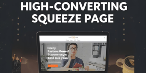
Example Squeeze Page Flow
Here’s a simple flow that works across industries:
-
Headline: “Get the Free 5-Day Fat Loss Meal Plan”
-
Sub-headline: “Save time, eat better, and start losing weight in just 5 days.”
-
Visual: Mockup of the plan on a phone/tablet.
-
Benefits list: Quick, tasty recipes; budget-friendly shopping list; beginner-friendly.
-
Opt-in form above the fold: “Send Me the Plan” button.
-
Social proof: “Over 10,000 people have downloaded this plan.”
-
Final CTA at the bottom: “Yes, I Want My Free Plan!”
Final Thoughts
A squeeze page is more than just a form on a page—it’s the gateway to your sales funnel. Done right, it can consistently turn cold traffic into engaged subscribers and, eventually, loyal customers.
The formula for success is simple:
-
A valuable, specific lead magnet.
-
A clear and compelling headline.
-
Clean design with no distractions.
-
Persuasive copy backed by social proof.
-
An irresistible call to action.
Combine these elements with ongoing testing and optimization, and you’ll have a squeeze page that not only looks good but converts like crazy.